

Color psychology in branding plays a powerful role in how customers perceive, engage with, and remember your business. For small businesses, choosing the right color palette isn’t just about aesthetics—it’s a strategic decision that influences emotions, trust, and buying behavior. Whether you’re designing a logo, packaging, website, or storefront, your color choices silently communicate your brand’s personality and values. In this post, we’ll explore how color affects customer perception, why it matters for small businesses, and how to choose colors that align with your goals and audience.
Why Color Matters More Than You Think
Colors trigger emotional and psychological responses within seconds. For small businesses competing in crowded markets, the right palette can:
- Build instant recognition (think red for urgency, blue for trust)
- Influence buying decisions by evoking specific moods
- Differentiate your brand from competitors
- Create consistency across platforms for stronger brand recall
- Support accessibility and inclusivity when chosen with care
Common Color Associations in Branding
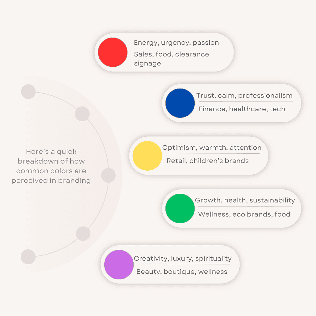
Here’s a quick breakdown of how common colors are perceived in branding:
How Color Psychology Shapes Customer Behavior
Color doesn’t just make things look good—it drives action. Here’s how:
- Trust and credibility: Blue tones often increase perceived trustworthiness, making them ideal for service-based businesses.
- Impulse buying: Red and orange can stimulate urgency and appetite, which is why they’re common in food and retail.
- Calm and wellness: Soft greens and neutrals promote relaxation, perfect for spas, therapists, and wellness brands.
- Luxury and exclusivity: Deep purples and blacks signal premium value, attracting high-end clientele.
Tips for Choosing the Right Color Palette
1. Start with your brand personality
Are you bold and energetic or calm and nurturing? Your colors should reflect that.
2. Know your audience
What colors appeal to your ideal customer? Consider age, gender, culture, and lifestyle.
3. Think about usage
Will your colors work across print, digital, signage, and packaging?
4. Test for accessibility
Use contrast checkers to ensure readability for all users.
5. Create a brand style guide
Document your color codes, usage rules, and examples to maintain consistency.
Why Local Salisbury Businesses Should Consider Color Context
Color meanings aren’t universal. What feels warm and inviting in one region may feel loud or off-putting in another. For example:
- Earth tones and vintage palettes may resonate more with Salisbury’s historic charm and rural elegance.
- Bright neon colors might clash with the expectations of a local audience that values authenticity and warmth.
- Inclusive design means choosing colors that are legible, accessible, and culturally respectful—especially in diverse communities.
Final Thoughts
Color psychology in branding isn’t just theory—it’s a practical tool that helps small businesses connect with their audience, build trust, and drive results. By choosing colors intentionally, you shape how people feel about your brand before they read a single word. Whether you’re launching a new business or refreshing your look, start with color—and make sure it speaks your brand’s truth.
Need help choosing the right palette for your brand? Book a free consultation with Genuinely Gina and get a custom color strategy tailored to your audience, goals, and local market.